As part of Urban Treehouse QC’s community goal, we wanted to use our brand Whale Watch to help with environmental concerns.
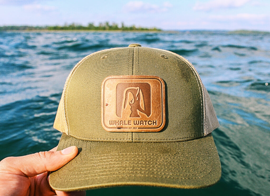
We have recently applied for the WDC Foundation, which means that if anyone buys a piece of merchandise such as the leather hat (see example and link below), they can sign up to adopt a whale as well!
https://adopt-us.whales.org/shop/?srsltid=AfmBOooMQH8WvwJYiUXvqsE-oe2ILPdAdKsXZVZJgpuBl1T_TfVphlMt

Hats we have sold previously.
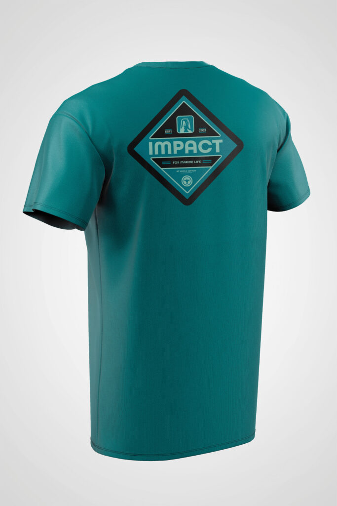
Because Urban Treehouse believes this brand is of high value to our environment, we want to expand our merchandising line. I recently experimented with putting some older brand marks I made into badge design systems for T-shirts and I came up with this visually-pleasing T-shirt.

Shirt with recent badge design. I wanted this to be an experimentation also with putting marks into larger badges for apparel.
This has also been an experiment that has gone hand-in-hand with our previous post (link below) about how to get more social media interactions.
I’m not going to lie. I’ve found myself getting frustrated with the lack of exposure this brand has gotten because it’s intention is to be for a good cause. In order to get this design more exposure, we decided to ask people within our networking circle to share opinions on what they would like to see for the naming of this design!
This is something that I have not yet tried when posting a design on social media, but I believe this will allow us to receive constructive feedback so we can make this naming within the design the most appealing it can be for people.
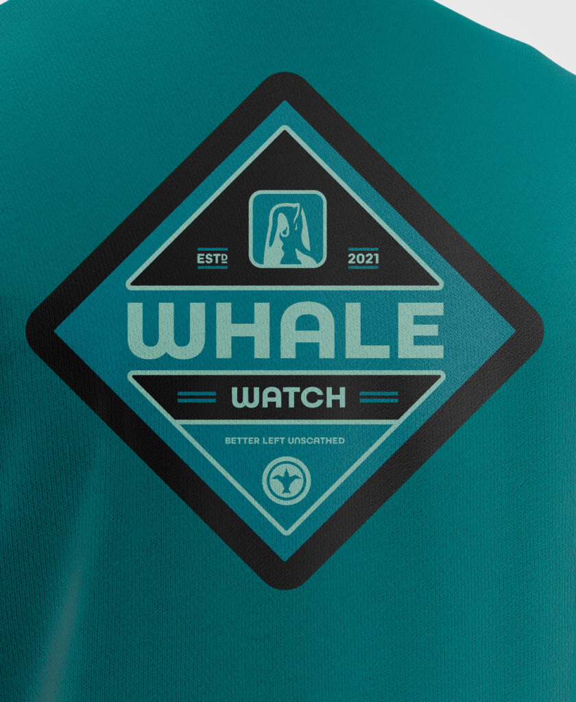
One point of emphasis upon planning this design was that using the word “whale” in a very large font might unfortunately make the shirt prone to misinterpretation since it’s typically aligned as a smaller font underneath the logo.

My example with the word “Whale”.
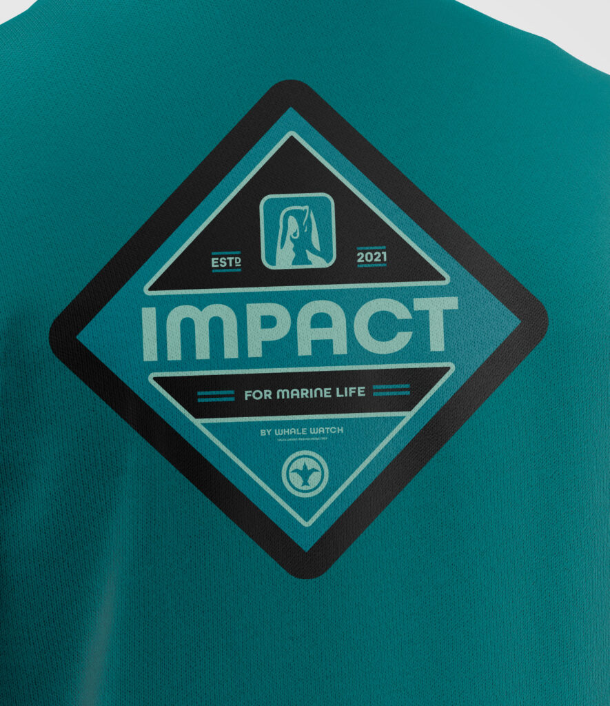
I believe that a word like “impact” will allow this shirt to make a little more sense as a larger badge on the back as it’s a safer, more common word that can be written in a larger font size. It will also allow anyone viewing these to more subtly take in the whale logo as it’s only a few years old and is still relatively unrecognized compared to larger brands.

My example with the word “Impact”.
If anyone has any other things they might like to see, please feel free to comment below (we just ask that all comments be kept respectful)!
I feel as always, it’s important to establish who our audience is. Our intention is to market these to nature lovers, particularly people who are fans of the ocean or the coast. We also want to target these towards people who want to make a difference in helping preserve wildlife. I originally marketed these towards Hawaii and the West Coast but anyone is welcome to participate if they value these general things in our world!