In my lifetime, I can’t really think of a time where talk about a design controversy has been more prevalent than with the 2024 Olympic Games.
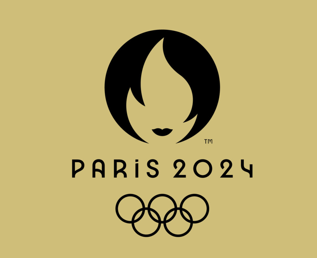
For starters, I have to say my first initial reaction was that this design was problematic, as a face didn’t seem appropriate for such a widespread audience due to the number of conclusions it could draw.
With the use of social media, people have jumped all over this and have created their own conclusions to this story.
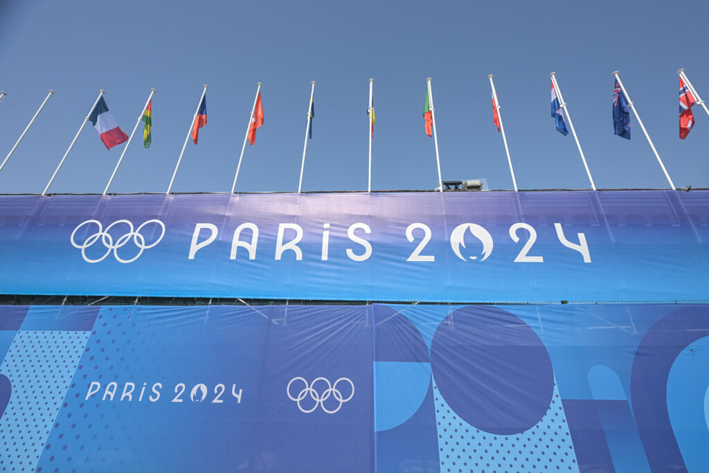
All this controversy initially caused me to view this project as a failure due to its lack of appropriateness for a wider audience. However, seeing it in context at the opening ceremony and the events did start to grow on me. I felt that it deserved a second look because I started to suspect that the double meaning between the face and the flame was intentional. I also could sort of see the aesthetic of a woman’s face with lips in the context of the Olympic Games being in France, as it can create associations with the idea of a “French kiss.”

After doing some research, I did find that it indeed had double meaning, with the torch being the Olympic torch and the face being a representation of Marianne who was a national personification of the French Republic during the French Revolution. She is supposed to represent that the Olympic Games are for the people and organized by the people as well as celebrating the 1900 Olympic games, a year in which men and women had the same amount of Olympic events for the first time in history.

Knowing this, I really applaud designer Sylvain Boyer for wanting to create something different. It’s important to know that Boyer has been exposed to many protests advocating for women’s rights and he recognized the powerful figure that Marianne was in communicating this idea. He had also felt that women needed to be more well represented in sports, which was a strong influencing factor for this design.
In my opinion, I have felt that the criticism by some designers is more about the fundamentals of logo design. This idea of appealing to a broad audience to avoid controversy or questioning by an audience does need to be considered when designing a logo, but I think this sort of innovation that Sylvain Boyer did also reveals a flaw in society’s thinking, which is very important to consider.
This might be a more important logo than we even realize. Is this actually an example where bad publicity can be good publicity? I would say this is a resounding and confident yes.
The fact of the matter is that this design tested our perception of reality. We are so unwilling to research stuff that our general reaction isn’t to inform ourselves, but rather mock and make assumptions. Again this is something that all logo designers should consider, but it’s fair to wonder if Sylvain Boyer actually wanted to test the limits of this idea.
If this was his goal, I applaud him for exposing all of us to a flaw in our thinking that we may need to reconsider.
Source Links
https://www.espn.com/olympics/story/_/id/40646955/2024-paris-olympics-logo-meaning
https://www.popsugar.com/fitness/funny-tweets-memes-paris-2024-olympics-logo-46795116
