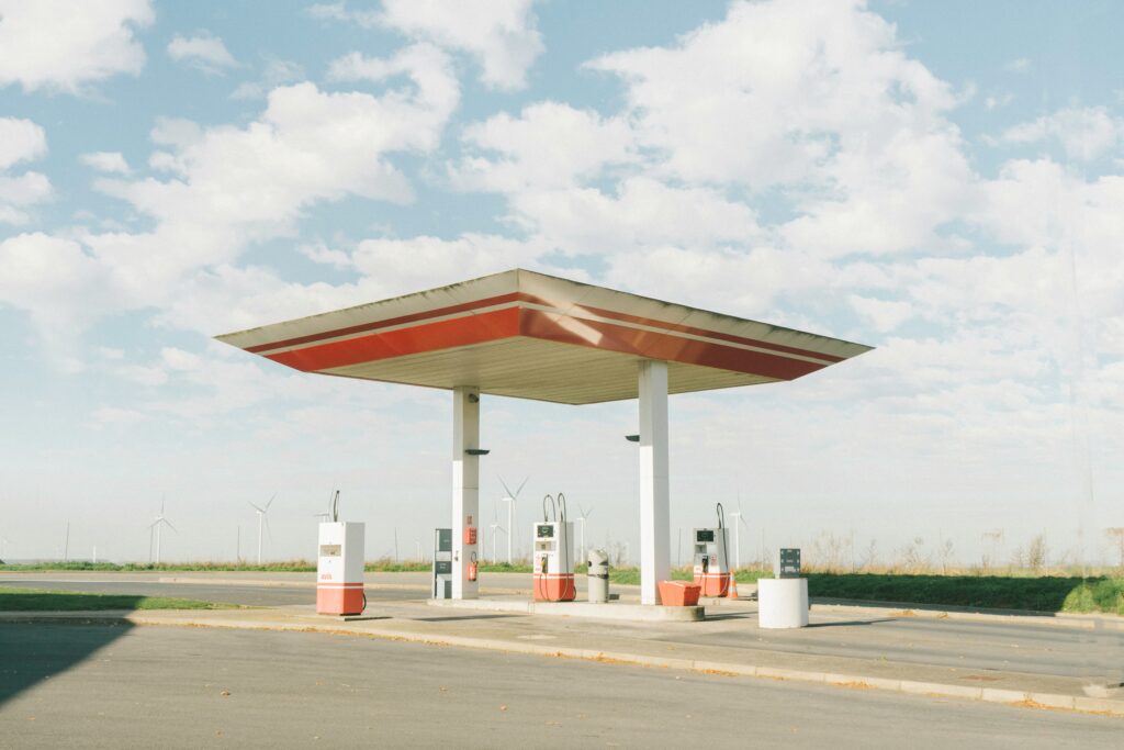
There’s something I need to get off my chest. In making efforts to donate to the ocean conservancy through our Whale Watch leather hats, I just now upon writing this realized it is a little awkward to explore a design pertaining to a gas station since the gas industry and the conservation industry are so conflicted. This was coming from a place of impulse rather than logic, but I decided to redesign a logo for a popular gas station. I hope this can serve as an example of how subtle changes can positively change the entire aesthetic of a business rather than an act of promoting the use of gas products.
For some background of where this love for gas station signage comes from, I’ve developed a keen eye for what looks pleasing when it comes to looking at signage on the gas stations I’ve stopped at on my 562 mile trips from Minnesota to Iowa. The ones that do look aesthetically pleasing inspire me to apply new knowledge to my own craft, while the ones I feel need reworked encourage me to make something that can better represent the brand. The point I’m making is that they always get my creative senses ticking!
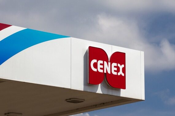
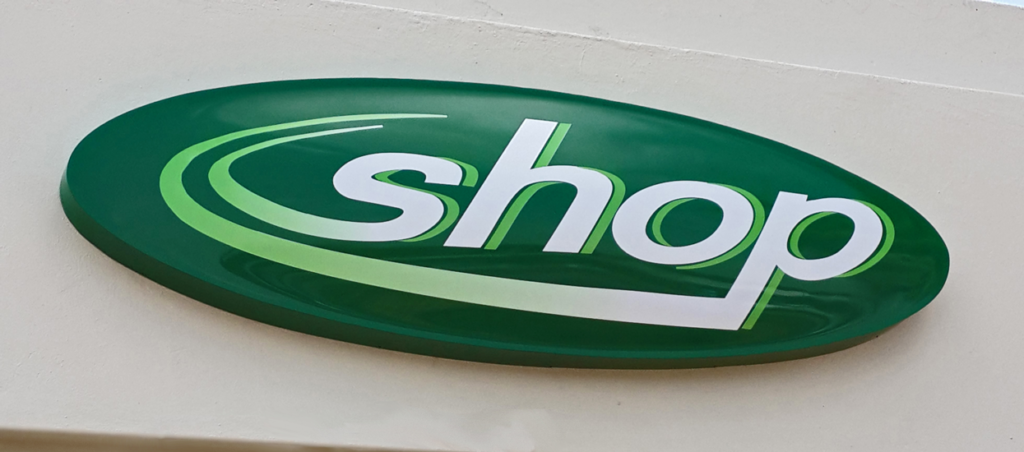
If there’s two of my favorites, it’s the Shop sign from BP and the Cenex sign. I think these serve as perfect examples of how graphic identities can look great with the use of strong visual narrative.
There is one gas station that I think has potential, but could also use a redesign. The Love’s gas stations are a common site on my trips to and back from Christmas and Thanksgiving with my family in Eastern Iowa. I have always thought the repeated patterns of hearts could have a better redesign by removing the dated-looking outlines and using a more modern font (see below).
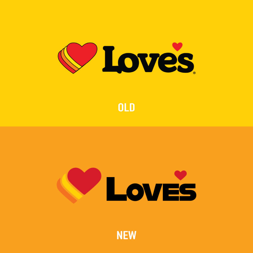
Generally, I wanted to maintain the general heart of the brand (no pun intended). Similar colors are used as well as the same format for the icon. The L also touches the O similar to the original design to convey the idea of love. I did not curve the heart on the bottom because keeping the edges straight will help it to appeal to a wider audience, especially truckers.
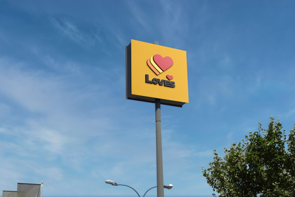
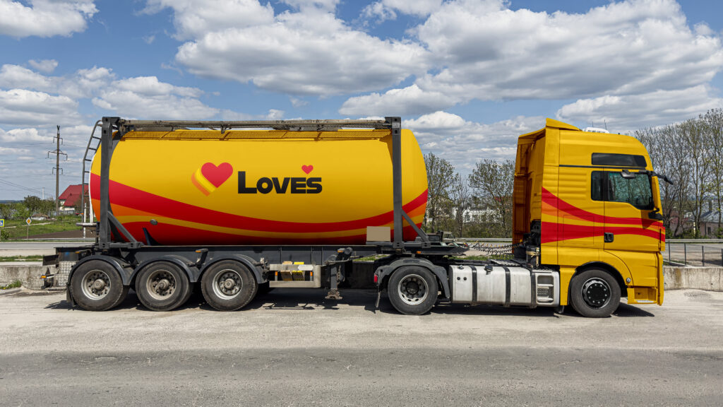
The result of all this is something that is timeless and recognizable to any person exposed to this brand. I hope that exercises like this can hopefully encourage all people running a business to take into consideration how one little mark can affect the look of their entire business.
Thanks and see you all next time!